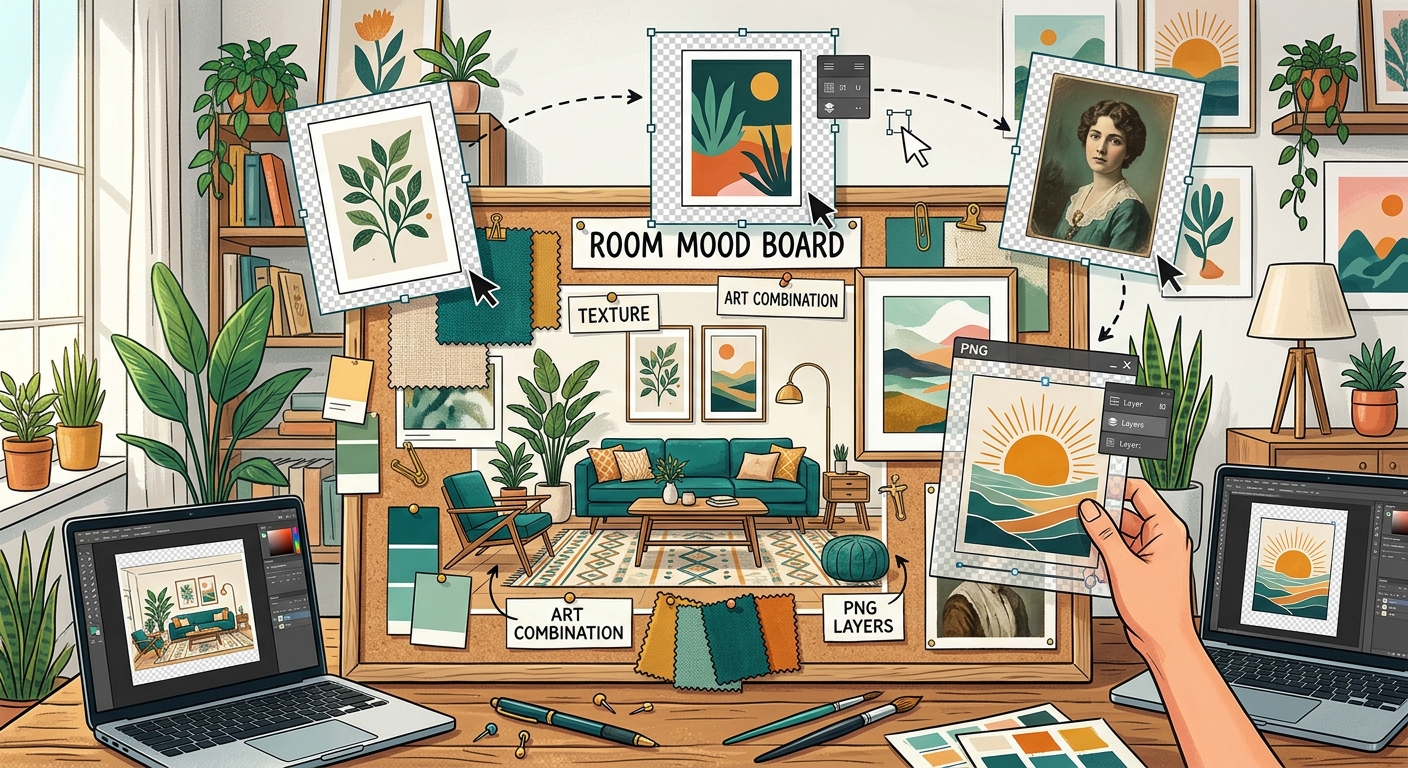
How to Combine Transparent PNGs and Wall Art in Room Mood Boards
Build a room mood board in Canva with transparent PNG furniture, plants, and decor. Learn layering, realistic scale, and coordinating wall art.

Search

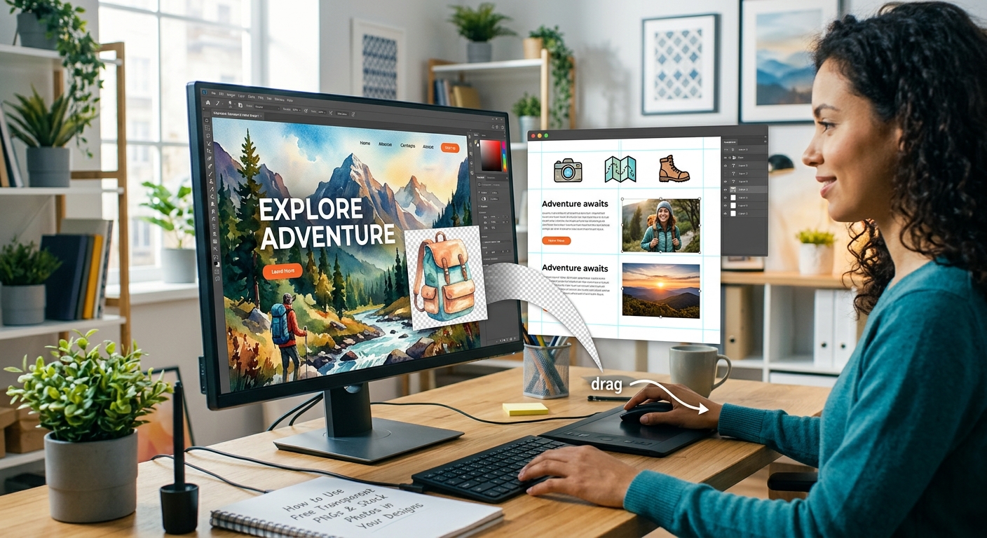
You grabbed a clean transparent PNG from a free library. No white box, no messy border, just the subject floating against nothing. That is the easy part. The part most beginners skip is finding a background image that makes the cutout look like it belongs there. Drop the PNG on a blank canvas and it reads flat. Pair it with the right photo and suddenly you have something that actually looks designed. That one-two combination is the foundation behind every great thumbnail, social post, and blog header you have come across.
The Cutout Is Half the Story. The Background Tells the Other Half.
A transparent PNG carries an alpha channel alongside its color data. The alpha channel tells your design software which pixels are visible and which are empty. Stack the PNG over a background layer and the transparent areas become windows, letting the layer below show through. That is the technical side.
The creative side is trickier. A crisp cutout of a football player placed over a blank white canvas looks like a website icon from fifteen years ago. That same cutout over a stadium at night, lit with green floodlights, looks like a match-day promotion. The background provides scale, atmosphere, and professional finish. The PNG provides the subject. Neither works particularly well without the other.
Color harmony matters here too. Your cutout has its own palette. A background that shares similar tones makes the composition feel unified. A background that clashes makes the PNG look pasted in, regardless of how clean the cutout actually is.
Before you touch a background image, confirm that your transparent PNG is worth using. A low-quality cutout will undermine even a perfect background.
Start with the edges. Open the PNG in Canva or GIMP and zoom in on the boundary between the subject and the transparent area. You want a smooth, natural line with no white fringe, no halo, and no rough pixelation. Any leftover background artifacts will show up clearly once you drop the PNG over a photo.
Check the resolution next. A PNG that looks sharp at thumbnail size can blur badly when scaled up to a full blog header at 1200 pixels wide. Make sure you are working with a file large enough for your intended output. For YouTube thumbnails the standard is 1280x720 pixels, so your PNG should be at least half that size on its longest edge to stay crisp.
Then verify the transparency itself. A grey checkerboard pattern in the background area means the file is genuinely transparent. A solid white or solid color background means it is not a true PNG cutout, and you will have extra work ahead. The PNG format was designed specifically to support this kind of alpha-channel transparency. The W3C standard covering PNG file encoding defines the alpha channel as a core part of the specification, which is why transparent PNGs have remained the go-to format for cutout graphics for decades.
Once your PNG passes the quality check, it is time to find a background image. This step deserves as much thought as sourcing the cutout itself. A generic gradient works in a pinch, but a real photograph adds texture, depth, and believability that no flat color ever matches.
You do not have to pay for quality backgrounds. Your best bet is a well-curated stock photo library that offers commercial-use images at no cost. These collections have expanded considerably and now cover everything from abstract textures and architectural backdrops to outdoor scenes and lifestyle photography.
When browsing for a background, keep these three points in mind:
Canva is the fastest tool for this workflow. Everything is visual and drag-and-drop, and it handles transparent PNGs automatically without any setup. Here is how to build a polished layered design from start to finish:
GIMP takes a few more steps but gives you more control over how the PNG blends into the background. It is particularly useful when you want to match the lighting or color temperature of the cutout to the photo, or when you are working with very large file sizes that slow Canva down.
Here is the core workflow:
Getting the layers right is the technical part. Getting people to click is the design part. YouTube thumbnails and social headers compete with dozens of other images in a feed at the same time, and the ones that win do so through contrast, clarity, and a clear focal point.
Use the rule of thirds when positioning your PNG. Place the subject at one of the vertical thirds of the frame rather than dead center. This leaves room for a title or channel name on the opposite side and gives the composition natural visual balance without extra effort.
Keep text minimal. Three to five words on a thumbnail is enough. The image itself should communicate the core idea, with text reinforcing it rather than explaining it. For blog headers, aim for an editorial feel over a promotional one. A muted background with a cleanly placed PNG and a short title reads as more trustworthy than a heavily saturated, overcrowded composite.
For Instagram and other feed-based platforms, contrast is what stops the scroll. High-key backgrounds paired with bold cutouts draw the eye fast. Avoid placing your PNG directly over a background area that is as detailed or as busy as the cutout itself. The viewer needs one clear focal point to land on first, then the rest of the design can guide them further.
The distance between a design that looks assembled and one that looks considered is not about software or budget. It is about pairing the right pieces intentionally. A quality transparent PNG plus a thoughtfully chosen background photo is the combination. Canva and GIMP are the tools that let you stack them properly and export something clean.
None of it has to cost anything. Free PNG repositories give you cutout subjects across hundreds of categories. Free stock photo libraries give you backgrounds with real photographic depth and commercial-use licensing. The workflow described above is repeatable, fast once you have practiced it a few times, and scalable to any size or format your content requires.
Start with one design. Pick a PNG, find a background, drop one on top of the other, and spend a few minutes adjusting the position, scale, and text. By the time you are done, you will have a finished asset and a process you can repeat in under ten minutes the next time a project calls for it.
Build a room mood board in Canva with transparent PNG furniture, plants, and decor. Learn layering, realistic scale, and coordinating wall art.

Combine transparent PNG cutouts with AVIF photos in Canva or GIMP. Build clear thumbnails and social posts, handle import issues, and export clean designs.

Step-by-step guide to layering free transparent PNGs over stock photos in Canva or GIMP to create polished social media graphics from scratch.